Menu
Why Choose Us?Cressey & Company
Needless to say, Cressey & Company is one of the most experienced and successful healthcare focused private equity firms in the country. With a reputation like that, their presence in every form of media needs to be held to a particularly high set of standards.
Cressey & Company were frustrated with their old site. It was more than just the functionality; their web identity over all was an issue that needed to be addressed. The old site was quite plain and contained fonts, colors, logos, and other branding elements that were inconsistent with current company identity standards. They needed to show a much stronger, more up to date, and highly organized face to present to the world in order to better reflect their company and core value proposition: partnerships.
However, building a good partnership is difficult to come by. A common challenge when redesigning a website is working with people who do not understand your business. Cressey and Company encountered this challenge, working with a number of prospects that pitched ideas at face value, but were unable to expand them into anything substantial. It takes an experienced professional with a keen understanding to listen to what the client is asking for, and develop a plan that will achieve noticeable results.
The Cressey team found our firm through one of the most powerful channels on the planet – Google. Right away, we worked to understand Cressey & Company’s core values, and made sure to approach the project with their ideals in mind. Before any money was exchanged, we worked with them to figure out their needs and wants, making recommendations that were not self-serving, but rather actual ideas that would help to move their business forward. Our actions helped cement the groundwork that almost immediately allowed us to be viewed as a partner, rather than a vendor.
Wasting no time, we began the collaboration process. And what better way to work together than in person? Rather than relying on phone or email, our team set up a half-day discovery session at Cressey & Company’s downtown Chicago office.
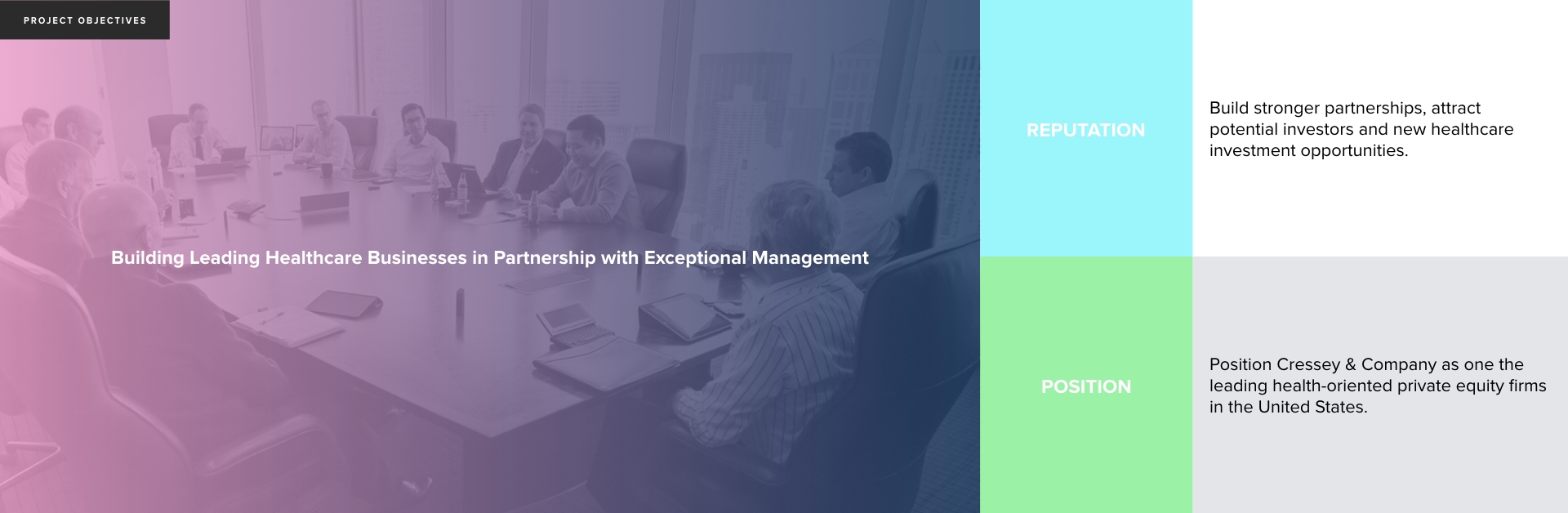
To start, we arranged all of the various pages that would exist on the site. From there, we reorganized the navigation into logical groupings and discussed in real time how to reorganize the pages that would need the most attention. We also examined several of Cressey & Company’s main competitors and identified the strengths and weaknesses for each before embarking on any website design standards.
With a detailed analysis of the site fresh in our minds, we set off to find a way to meet the client’s vision. There was one critical piece still missing. The content.
The content provided to us was not necessarily bad, in fact it was far from it. The problem was that it lacked a certain flair. In order to avoid repeating the mistakes of the past, we developed a strategy to augment the content experience that would bring the pages to life. This concept really drove the entire design, and allowed us to push for unique page visuals.
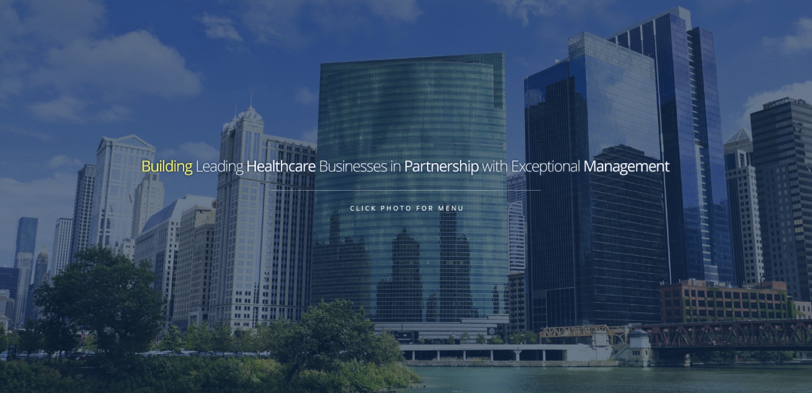
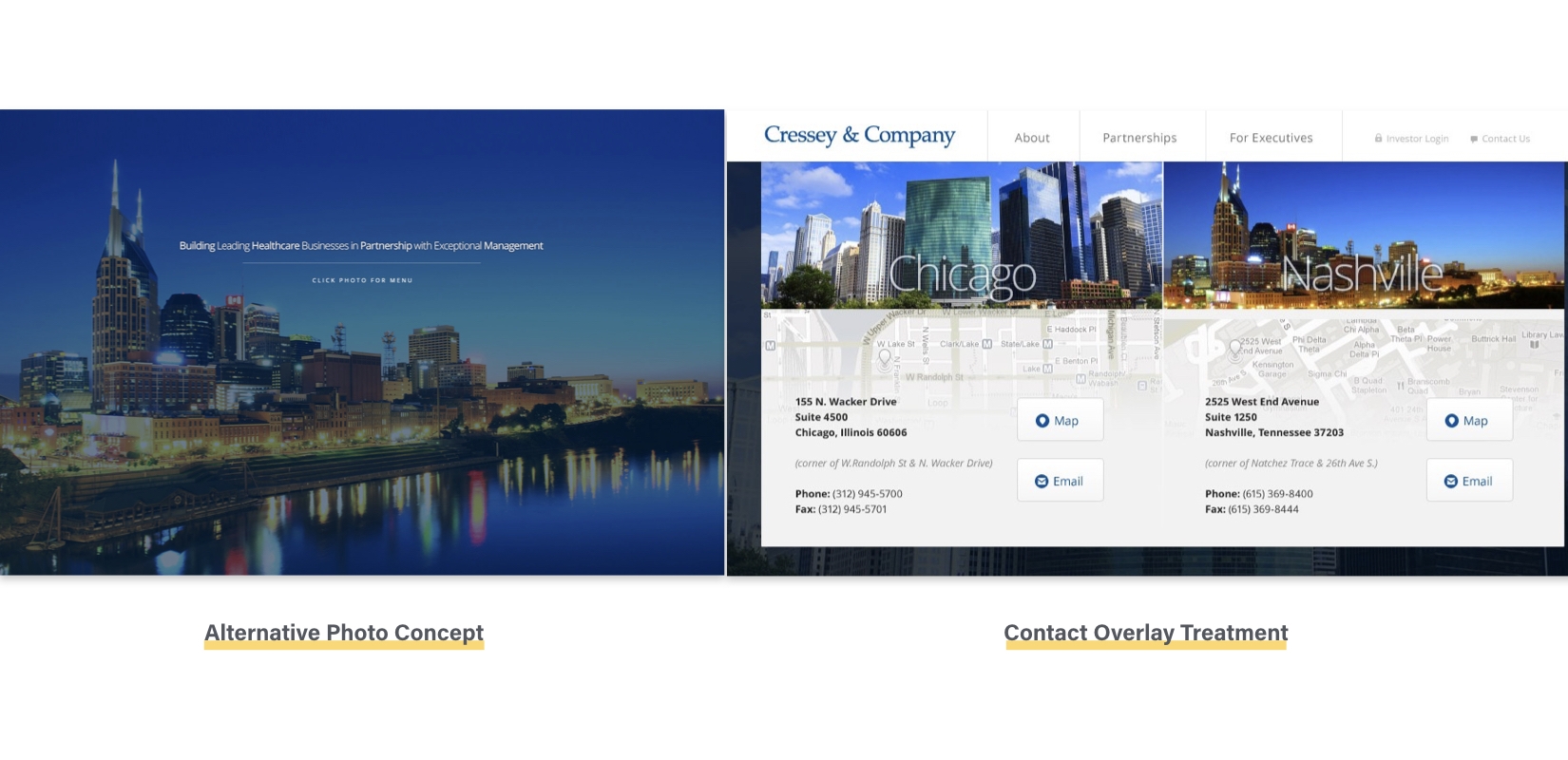
Cressey & Company wanted something simple that used large, visually appealing graphics to showcase their successful business in Chicago. Working off their idea of using large graphics, we took the design one step further and included two beautiful alternating images of the Chicago and Nashville offices to act as a focal point when accessing the site. We made a conscious decision to hide the navigation when first entering the site in order to strengthen this visual further, but included a subtle, yet clearly visible, way to have the user click to show the navigation when they were ready to explore the site further.
Knowing that the subpages needed more than just a flashy background, we pushed for custom photography. We guided Cressey & Company on the direction of the shoot, providing a shot list and descriptions of the imagery that we felt would compliment the site best. This would also ensure that the photos would be used for other marketing collateral. With a short list in hand, Cressey secured a photographer who shared our vision to provide something beautiful. The photographer flew to each partner’s location to take pictures for the full Cressey experience. This gave life to the company’s image, and allowed further visibility into their business for potential future partners.
Another idea to add character to the copy was to create call out areas in order to emphasize important sections site-wide. We found that the most promising aspects of the copy were the ones that called out how much experience Cressey & Company had in the world of investments. We worked some of the more telling facts and statistics into custom graphics that we used to populate the pages throughout the site.
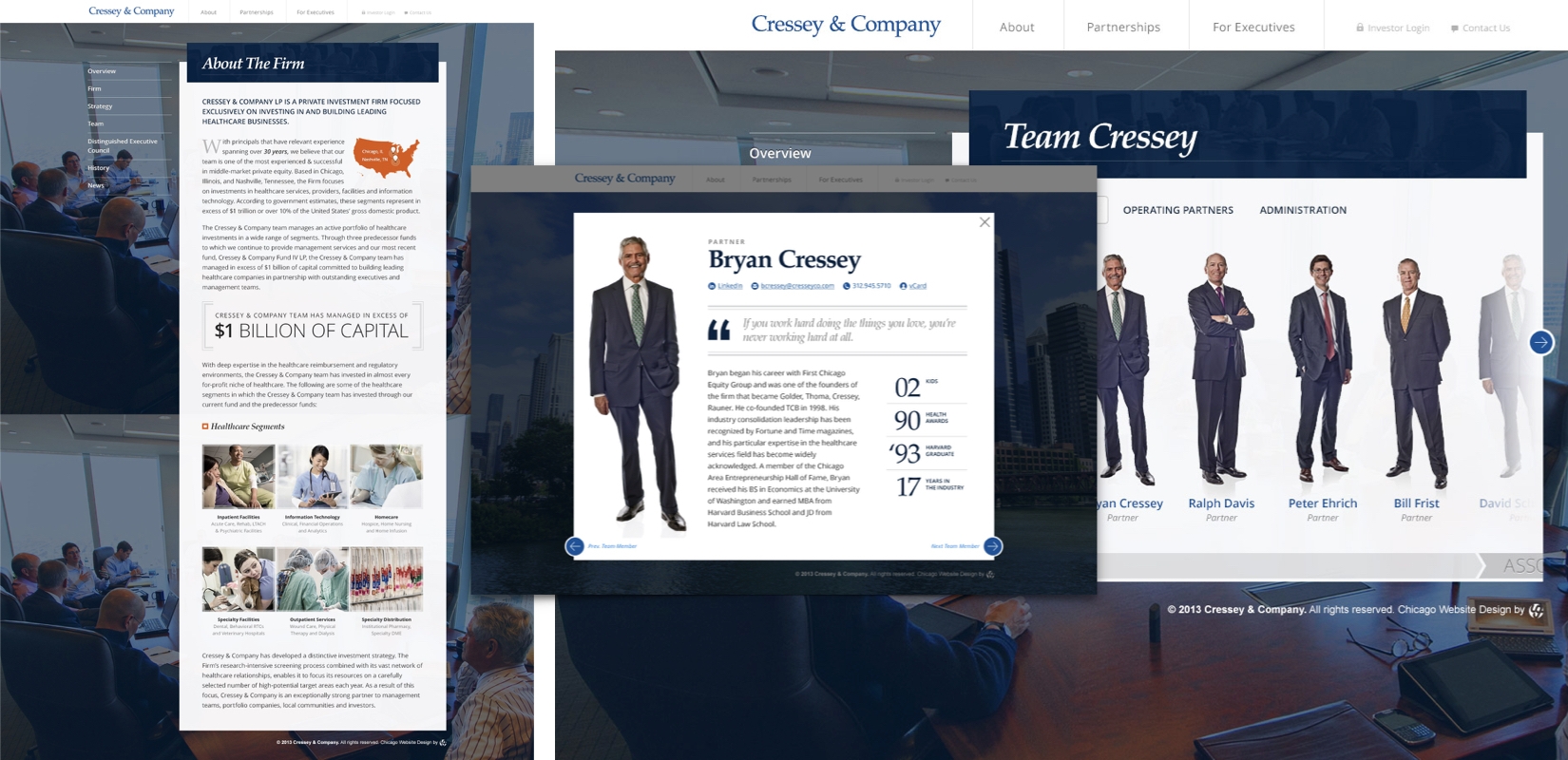
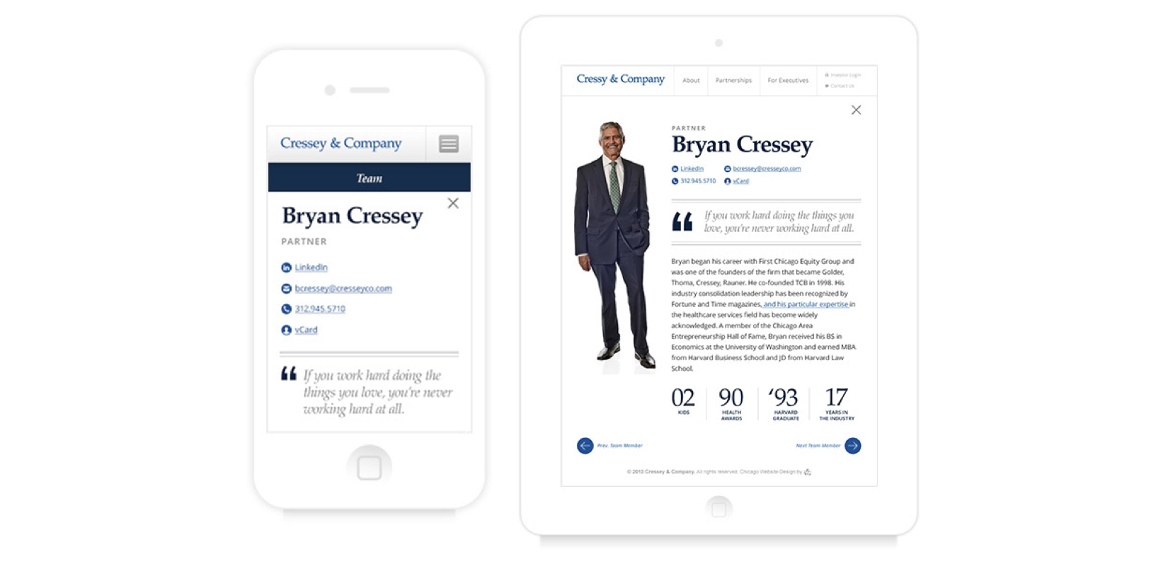
The Team section is where we enhanced the visual story-telling experience. Cressey & Company wanted a unique, yet modular, way of showing a team that would showcase each individual in a professional manner. To achieve this, we used a full body shots of team members, and incorporated these photographs into a slider that would allow the user to rotate through them. When clicked, a personal bio complete with quotes and unique facts would appear.
With large, visually captivating images on many of the website pages, we were able to convey Cressey & Company as a team of professional, experienced individuals focused on building partnerships.
The designs we devised were quite ambitious, which lead to a number of challenges for our front-end developers. Most of these challenges occurred when trying to transform the static deign concept into a fully interactive experience.
When making the site interactive, we wanted to use a number of subtle transitions. The end goal was not to interrupt the user experience as they flow through the website. One of the ways we accomplished this goal was through the use of light box treatments. The reasoning behind this was that when a user clicks on a link, it brings up the information without having to leave the current page. This makes for a quick way to navigate the website.
Another aspect of adapting the design was making the site responsive to fit all platforms and screen sizes. We examined each element under a microscope in order to see how they would look and function when resized to different screen sizes. The easiest part was adapting the typography so that the content was still legible on a smaller screen.
A key challenge we faced making the navigation simple and effortless, which is why we built a slide out, side bar navigation for mobile device users. This allowed us to put everything in one area and achieve a hierarchy that clearly displayed the parent and child structure of the different sections of the site. Then came the little bells and whistles in the form of intuitive gestures, like using a hand swipe motion rather than a simple click for the slider on mobile devices and tablets.
While refining the site, our designers and developers worked together to make changes in the browser, rather than on a static composition, in order to see the exact outcome of each change. These changes would range from layouts to tiny pixel adjustments across various graphics. The end result was a site that worked flawlessly on a variety of systems.
The Usman Group holds this private equity website design project in high regard and we are proud of the final output. Working side by side with Cressey & Company was an excellent experience from start to finish. From the information architecture, to the wireframes, to the custom website development, we pushed the boundaries of our process to produce a best in class experience.